The Intersection of Front-End Development and Accessibility: Best Practices from Leading Companies
The front end of your web or mobile application is the portion that users see. Therefore, do ensure that your front end development company builds it to work for everyone, regardless of hardware, software, language, location, or aptitude. Accessible front-end development ensures that people with diverse abilities may access, comprehend, and navigate it
According to data from the World Health Organization (WHO), there are more than one million people across the globe with disabilities, and these numbers are growing day by day.
Therefore, if we do not consider this demographic while developing the front end, we will lose a significant portion of our prospective clientele.

Web accessibility guarantees that all site visitors have a smooth experience irrespective of ability. Unfortunately, many websites do not adhere to web accessibility best practices and guidelines, making it challenging for impaired users.
Thus, while hiring front end developers, do ensure that, along with considering your target demographic, your value proposition, and turning your concept into a tangible reality, they must integrate front end with accessibility.
Due to the advancement of the digital transition, web accessibility is more crucial than ever today. This has opened a wide range of options for people with disabilities to access crucial data, services, products, and other resources online, enabling them to perform practically any action, from voting in elections to ordering Pizza.
Whether you are a startup or an established business, we are sure you want to get as many visitors as you can to your web pages. If you don’t give accessible web design priority, though, this could be challenging.
We’ll discuss the significance of website accessibility in this post. We’ll then learn about the website accessibility checklist used by reputable front end development companies.
First, let’s clear the concept of web accessibility!
What is Web Accessibility?

Making websites usable for all users, including those with impairments, disabilities, and limits, is known as web accessibility. It encourages using inclusive design, integrated technology, and software to achieve this.
A front end development company must adhere to a set of guidelines or standards called web accessibility when designing user interfaces for persons with disabilities, such as color blindness, low vision, blindness, cognitive impairments, hearing loss, and mobility issues.
The World Wide Web Consortium (W3C), working with international governmental organizations, compiles the web accessibility guidelines. Some nations view these as recommendations, while others—the US, Israel, Canada, and the UK, to mention a few—have laws requiring them to follow the web accessibility checklist.
Why Accessibility should be a Priority for Front End Development?

Various aspects of our lives, including work, education, government, commerce, recreation, health care, and more, rely on the Web and the Internet. Web accessibility allows people with disabilities to experience equal access to a digital platform.
Let’s understand why front end development companies must consider accessibility and follow accessibility best practices in web design.
Importance of Accessibility in Web Design
| Great Number of Disabled people | The rising number of persons with disabilities is a key factor in adding website accessibility. The CDC and the World Health Organization estimate that 26% of Americans and 16% of the global population are disabled. Websites must be accessible to everyone because a significant section of the population is affected by impairments. |
| Helps Maximize Business Reach | Website accessibility should be a top priority for businesses as it helps reach a wider audience. Because the site is simpler for all users, it can assist you in tapping into this enormous and frequently ignored market, which could result in higher income and growth by increasing engagement, sales, and customer happiness. |
| Improved Search Engine Optimization | A better user experience will result from accessibility, which will benefit your website’s Search Engine Optimizations (SEO) activities. Your website reach will increase due to improving ranking in search engine results pages (SERPs). |
| Compliant to Laws | A website’s compliance with rules and regulations like the Americans with Disabilities Act (ADA), the Rehabilitation Act, and the European Accessibility Act (EAA) are implemented with a focus on accessibility. Laws forbid discrimination against people with disabilities. If the rules are not followed, a user may sue the business for accessibility violations in certain countries. |
Given the arguments, it is clear that adhering to the web accessibility checklist is one of the most excellent web design practices in 2023. Let’s explore all such web accessibility best practices to make your website more accessible and cover a wide range of users.
Essential Web Accessibility Checklist 2023
The Accessibility Guidelines Working Group establishes web accessibility best practices. The goal of this group is to create specifications to help make the front end of web or mobile applications accessible for people with some disabilities. Here are the top 10 excellent techniques for including accessibility on your new website.
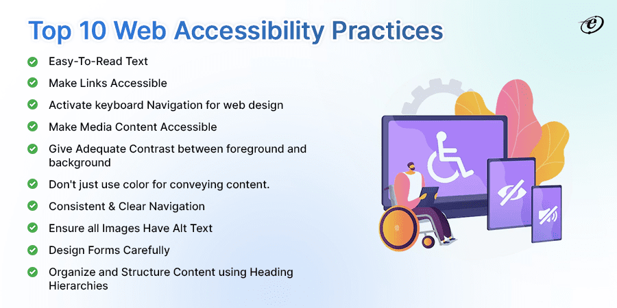
1. Easy to Read Text
One of the main problems for screen readers and visually challenged users is readability. To ensure everyone can read and understand the text, designers must increase legibility (letter clarity) and readability (text block clarity).
Harvard Digital suggests below recommendations for improving readability.
| Typography | Consistently use the same typeface throughout the website for clarity and uniformity. |
| Text | Avoid underlining unless it’s for links and align your content to the left. |
| Resizing | Make sure your website allows text resizing and avoid using narrow text columns because they can create scaling challenges. |
| Proper Spacing | Users can more easily distinguish between related and unrelated text thanks to the effective use of space in visual design. |
| Avoid all Caps | All caps are difficult to read, and it also expresses to readers that you’re shouting at them by using all caps in your text because that is termed “shouting.” So, avoid it. |
According to W3C following are design strategies for text clarity:
- Large and bold fonts can have a 3:1 ratio.
- A minimal contrast ratio between text and background is 4.5:1.
- For body text, use a minimum of 16 pixels.
- At least twice the font size should separate the paragraphs.
- Ensure letter spacing is at least 0.12 times the font size.
- At least 1.5 times of the font size must be used for line spacing.
- Tahoma, Calibri, Helvetica, Arial, Verdana, and Times New Roman are a few accessible fonts.
- Instead of fixed pixels, use CSS’s adaptive/responsive font scaling (em, rem,%, etc.)
2. Make Links Accessible
Using descriptive link titles will help visitors who use screen readers to navigate your website and gain insight into the purpose of the link and where it will be routed.
Links should be descriptive and intriguing; every link should be labeled with what they do. Screen reader users can choose where to navigate next by listing every link on a page. This feature, however, is useless if the text says, “Click here” or “Learn more.”
Besides this, one more essential web accessibility checklist is designers should also avoid using the entire URL as a link because screen readers must read or type the whole string, which can be difficult for long, ambiguous URLs with letters and numbers.
Medium articles, for example, employ randomly generated letters and digits at the end of URLs. For screen readers, copying and pasting this medium article URL would be a nightmare:
A better alternative would be to hyperlink the headline of the article: Angular Vs React Vs Vue — Which Should You Choose?
3. Activate keyboard Navigation for Web Design
Providing easy and smooth navigation for millions of users with motor function and vision issues is a critical component of web accessibility. Some visitors to your website will not use a mouse or a touchpad to navigate. As a result, an experienced front-end development company ensures that your website’s functionality should be accessible just through the keyboard.
The tab key, for example, should allow users to navigate between selected components on the page, and the enter/return key should “click” the element in focus.
You must ensure your website can navigate and browse using a keyboard only. To test this, we navigate to the front end of our website and use the Tab key to navigate around the page:

You should be able to navigate the page by pressing the Tab key. If it doesn’t, you probably have some work to do!
The WebAIM keyboard accessibility design guide can assist you in building keyboard-friendly navigation.
4. Make Media Content Accessible
A web page takes on a new level when it contains media, such as photographs, video, and audio, which enables visitors to consume content in their chosen format.
Some users may be left out by the media. For instance, deaf people cannot hear audio or watch video information. Users who are blind cannot view photos or videos.
Therefore, front end development companies generally offered multimedia alternatives, such as transcripts in text or audio files, to make the website’s content more accessible to users who are blind or have hearing loss.
Here are some web accessibility checklists for media content:
- Add a transcript to any audio files and captions to any videos.
- Always include descriptive, pertinent alt text for photos, icons, and other still media.
- Give each picture in a carousel a caption (and remember to enable keyboard navigation).
- Please avoid using any substance with strobe or flashing effects because they may cause seizures.
- Disable autoplay, which could harm users with seizure disorders or cognitive impairments.
5. Give Adequate Contrast between foreground and background
Almost everyone using your product finds it challenging to understand what is on the screen because of the contrast between the text and background.
Try to picture what a blind person would experience- Step aside from your clear retina display and seek out a conference room with a projector to get a sense of the battle. After that, connect a VGA adapter to your MacBook to examine how low-contrast UX/UI designs appear to people with vision impairments. I know; you get the gist!

For web accessibility best practices, it is required that the colors of the background should sufficiently contrast with the foreground text. This applies to items like buttons, background gradients, and text on images. Logos and incidental text, such as text that happens to be in a picture, are exempt from this rule. The contrast ratio between the text and its background should be at least 4.5 to 1.
The WCAG lists a few exceptions to this contrast ratio, those are:
- There is no requirement for contrast for text (or text-like pictures) inside inactive UI components.
- This minimal ratio can be reduced to 3 to 1 if your font is at least 24 pixels wide (or 19 pixels wide if bold).
- There is no requirement for contrast in text contained within a company logo, brand name, or logotype.
Additionally, WCAG recommends adding colors with greater contrast to the entire UX/UI color palette. However, many UX and UI designers prefer designing with increased contrast.
Example: Contrast ratio
Insufficient
I am not able to read if there is no accurate contrast between the text and background.
Sufficient
I am not able to read if there is no accurate contrast between the text and background.
6. Don’t Just Use Color for Conveying Content
Your users will be able to identify various information sets with the aid of colors quickly identifier. When developers neglect to maintain a suitable contrast of colors, users with color blindness and other disabilities may find it challenging to locate information, call-to-action buttons, or other elements.
Add the Google Chrome extension- “Colorblindly” to your browser if you want to see your website’s color contrast from the perspective of a colorblind person.
350 million people, or 4.5% of the worldwide population, suffer from color blindness. So front end development company must incorporate a second indicator along with color to help color-blind people distinguish between different types of material. For instance, many message states, such as error, warning, and success, use icons and colors to denote distinct sorts.

Here is some advice from professionals to help with more accessibility.
- Ensure that text resizing doesn’t impair reading.
- Make use of a range of color and contrast intensities.
- Offer substitute information delivery techniques, such as audio, video, and touch.
- Throughout the website, use language that is straightforward and concise.
- Regularly check to see if your website complies with web accessibility best practices.
When hiring front-end developers, ensure they check for these color concerns using accessibility tools. The Colour Blindness Simulator and Contrast Checker in UXPin allow them to check their work instantly.
7. Consistent & Clear Navigation
The structure and appearance of your entire website greatly influence users. You can ensure users find what they’re looking for by carefully planning your navigation. People may quickly discover the information they need with good navigation, but they may feel lost and confused with poor navigation.
An unclear design might lead to challenges that frustrate all users. For people who need adaptations due to a disability, it’s an even bigger issue.
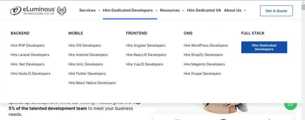
Here is an illustration of what an easy-to-understand and effective navigation plan looks like:
Take a peek at the eLuminous Technologies website’s properly built navigation.
Check out the useful guidelines provided by WCAG for improving the usability of your website:
- Make sure the links stand out from the rest of the page’s text.
- Use fewer links on each page than necessary.
- Give the user easy access to the many sections of a website.
8. Ensure all Images Have Alt Text
Users gain a lot from images on a website. However, these images can hinder individuals with poor or limited eyesight.
We’ll see how!
Screen readers are frequently used by people who are blind to “read” the web content. The user will hear a description of any images or photos that the screen reader comes across. The level of usefulness or quality of that description varies greatly and depends on the level of UX/UI work of the designer.
In light of this, if you use images on your website, make sure to provide alternative text (alt text) that describes the image. In this way, screen readers can help visitors who are unable to view the image grasp the page’s content. Additionally, Alt tags help you get a better Google SEO ranking.
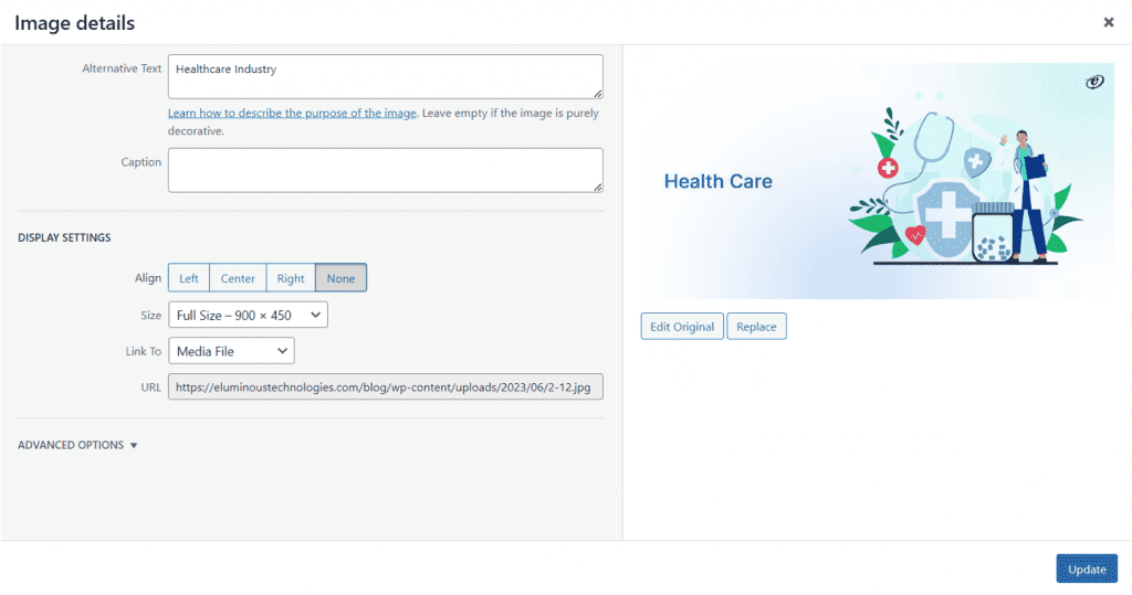
The web accessibility checklist includes writing a description that gives readers context for the image, explains what’s going on, and explains how it ties to the story. In contrast, add an empty “alt” text attribute to an image if it serves solely as decoration or is unnecessary to make it skippable for screen readers.
9. Design Forms Carefully
Forms should be carefully designed because some users may find them challenging. This includes ensuring that the form is user-friendly and that each field is clearly labeled.
Make sure each field has a label that describes what it is used for. Except for checkboxes and radio buttons, which are often to the right, labels for left-to-right languages are typically positioned to the left of or above the field. Limit the distance between labels and fields.
It is crucial to appropriately identify text fields with a descriptive title when creating online forms so that users of screen readers can complete the forms. Your online forms’ accessibility will increase using label tags or an ARIA property.
For example, you could also include placeholders with text that appear in the form fields. They will better understand how to complete the form as a result.

10. Organize and structure content using heading hierarchies
Make the content easier to read by dividing it into smaller chunks. Because of this, structuring the information on your pages with headlines and lists helps improve web accessibility.
When appropriately utilized, headers are an excellent tool for structuring and organizing content on a webpage. This makes it simple for all people to navigate your website’s pages and even raises your SEO ranking, which makes it simpler for you to drive more visitors to your website.
Clear headings make your pages more accessible for screen readers to read and comprehend. Additionally, it makes it easier for users of assistive technologies to browse your page’s contents and helps with in-page navigation.

WordPress suggests following a predetermined heading structure, which calls for utilizing one H1 per page (usually for the header) and H2s and H3s for subsections. The web accessibility best practice uses these headings in the following order: H2s should come after the H1, then H3s, and finally, H4s (if necessary).
How to Check for Web Accessibility?
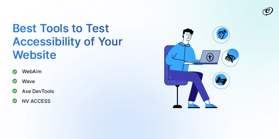
After covering the web accessibility checklist now, it’s crucial to check the accessibility of your website. There are various testing tools to check your website. Let’s explore some major ones.
NV ACCESS creates and promotes free and open-source software that makes it easier for persons who are blind or have low vision to access technology. Developers can track focus objects on the screen with the help of its focus highlight function. Additionally, the screen reader’s voice viewer allows developers to view the output as text.
| WebAim | To guarantee that the component conforms with the WCAG criteria, the specialists at WebAIM may audit your website and generate a thorough report. |
| Wave | Web Accessibility Evaluation Tool (WAVE) is an easy and popular tool for front end developers. It pinpoints issues and offers a remedy to address them. Additionally, it displays error icons and indicators on the webpage to provide accessibility information. |
| Axe DevTools | Front-end developers may easily detect and correct 76–84% of accessibility mistakes using this automated accessibility testing tool before developing applications. You can complete the manual test more quickly, even if you lack expertise, thanks to Intelligent Guided Testing (IGT). |
Improve Web Accessibility to Maximize Your Business Reach
Out of one in four Americans live with a disability. They browse applications to stream movies, purchase online, and access digital content like everyone else. They also expect and deserve equitable access to your products. Therefore, every front end development company must cover the web accessibility checklist while designing and developing web applications.
Accessibility helps those with cognitive, visual, motor, auditory, or speech impairments to benefit the most from your digital product. If you design for accessibility, your product’s UX or UI won’t suffer, instead, increase the reach of your business.
This article covered web accessibility best practices you might employ while creating an accessible website. Adhering to these design principles promotes a fairer web experience and guarantees that as many individuals as possible access your website.
Want to hire front end developer who can ensure 100% accessibility in your dream project? eLuminous Technologies dedicated front end development team is the best choice for covering your needs. Talk to our experts to learn how we can maximize the reach of your business.


