In the earlier post, i.e., demystifying UI/UX for Web Designers I shared the most important aspects that a web designer needs to consider before designing a website. In this post, we are going to find out how to use some logical elements that make the clients fall in love with your website.
Here are some of the aspects for understanding the psychology of UI/UX:
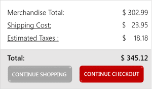
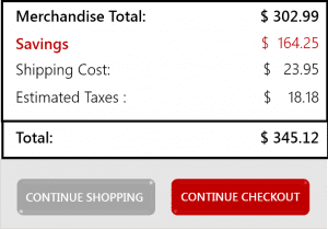
- Contrast Principle: This is something you usually find in shopping malls. You like a pair of shoe, you check the price, and it shows $100. Not in your budget right? You again go to an online shop, like another pair of shoes whose price is $120 and they are giving a 15% discount which makes the price $102. You are so excited that you are saving $18 that you can’t help yourself from buying that product. Eventually, you end up spending $2 more than you were willing to. This is the contrast principle that companies use to attract more customers. For e.g.
The website that shows a larger amount of savings makes a better impact as compared to the previous one. You may make a good use of this principle of UI/UX to attract a number of conversion and customer satisfaction.
- Follow practices that your users are comfortable with: I am sure you/ your web designer intend to do something exceptionally creative but make sure you don’t lose your customer’s interest from your website while trying to do that. You might think you are designing something which is unique from others, however, your customers ha
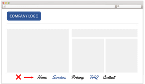 ve already created an image of your website in their minds. They already know what options they have to click on and where the contact form is going to be, just like other websites that they have browsed till now. If you place your menus at unusual places like mentioned in this image, your customers might switch to your competitors website where they don’t have to waste their time in finding out menus and sub menus.
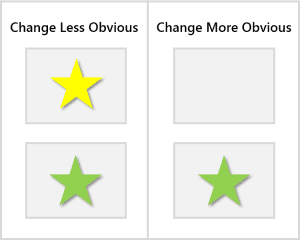
- A technique to make transient changes to be noticed: If you want the visitors to notice something new while browsing your website, try to add or resize a certain object from your website rather than just changing its color. Changing the style makes a much better impact as a user imagines a particular fictional image of your website and i
 f something occurs differently, it immediately catches his attention. For e.g. when you see this image, the missing box makes more impact than the one with the changed color. In the blank image, I began to think why is this missing, when I can see it back etc. whereas, with the yellow star, I thought that the color change is common and its nothing extraordinary.
- Getting right with the fonts: Have you ever been to a website where nothing is readable other than the logo. I have, and it annoys me the most. Web designers try to use some non-standard fonts to look stylish, b
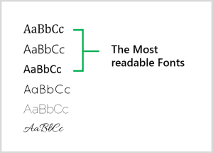
 ut seriously, those stylish fonts are not readable for a normal user at all. If you want to show your creativity, go with those HTML effects and newly introduced modules, but keep your fonts simple and standard. Now if
you look at the fonts in this image, only the first three are readable (ideally talking about the website), and the rest of the three are surely going to take time for the users to understand. Additionally, if the user is checking the website through his phone, he is going to have a hard time reading the other three fonts. Usually Calibri, sans-serif, Segoe UI Semilight, Cambria, Verdana etc. are counted as the reader’s favorite fonts.
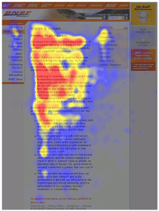
- Understand the user’s website scanning strategy (F Shape): An eye tracking visualization study shows that viewers opt to read the Web pages in an F-shaped pattern: two
 horizontal stripes followed by a vertical stripe. Here is the sample image of the web page which was tested through an eye tracking device. The viewers initially read in a horizontal method on the top layout of the website. Then they go a little on the bottom area and then read across in a second horizontal method that typically covers a shorter area than the previous movement. And at the end, they scan the website’s left side in a vertical way. Occasionally this is a relaxed yet systematic scan that appears as a solid stripe on an eye tracking results.
Blogger, Internet Marketer, Marketing Analyst.

 f something occurs differently, it immediately catches his attention. For e.g. when you see this image, the missing box makes more impact than the one with the changed color. In the blank image, I began to think why is this missing, when I can see it back etc. whereas, with the yellow star, I thought that the color change is common and its nothing extraordinary.
 ut seriously, those stylish fonts are not readable for a normal user at all. If you want to show your creativity, go with those HTML effects and newly introduced modules, but keep your fonts simple and standard. Now if
 horizontal stripes followed by a vertical stripe. Here is the sample image of the web page which was tested through an eye tracking device. The viewers initially read in a horizontal method on the top layout of the website. Then they go a little on the bottom area and then read across in a second horizontal method that typically covers a shorter area than the previous movement. And at the end, they scan the website’s left side in a vertical way. Occasionally this is a relaxed yet systematic scan that appears as a solid stripe on an eye tracking results.

