7 Checkout Flow UX Tactics that Boost Your Conversion Rate
Today, ecommerce website optimization is a well-oiled machine that covers aspects such as navigation, design, and content to help convert your visitors, i.e. make them buy something.
However, not enough attention is paid to optimising the checkout flow of ecommerce websites or apps, which is where the actual money is at.
For instance, one of our client’s ecommerce website had an 87% payment page conversion rate, i.e. the percentage of visitors to the payment page who went ahead and made the payment.
We figured that just by increasing this figure to 90%, our client’s monthly revenue would rise by $14,731 – a 17% increase in revenue on a 3% increment in payment page conversion rate.
As an ecommerce-focussed custom web application development company, we’d be the first ones to admit that an improvement of 3% when you already have a high conversion rate of 87% is much harder than it sounds.
But by optimizing your ecommerce store’s buying process with these seven checkout flow best practices, rest assured that the law of diminishing returns won’t come in the way of improving your conversion rate, sales, and revenue.
7 Steps Towards a High Conversion Ecommerce Checkout Flow
- Offer Guest Checkout
Covid-19 led to a massive spurt in online shopping and, from available evidence, has also permanently altered many aspects of customer behaviour. However, some aspects of that behaviour remain unchanged.
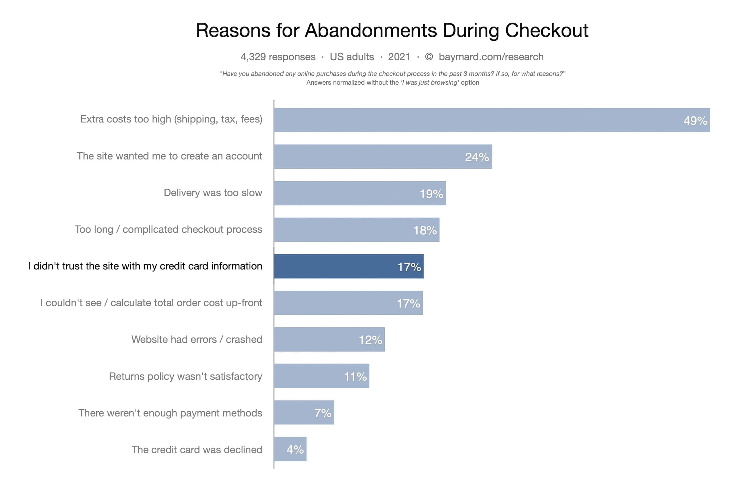
For instance, as per a Baymard Institute survey of adult US online shoppers, 24% of buyers abandon their shopping cart because an ecommerce store asked them to create an account to complete the purchase.

Now we understand that, as a seller, you’d like to have some customer data to help explore opportunities for future product suggestions, promotions, and even upselling. But as this survey shows, a significant number of online shoppers would rather have the option to choose a product and pay for it without creating an account.
This is why you must add a guest checkout option to your checkout flow UI. This ensures your customers don’t have to waste time filling out forms and giving away their important info, thus increasing your conversion rate.
Tip: If you cannot offer a guest checkout option, do the next best thing by reducing the number of details required for creating an account.
Another option is to enable social media logins, a single-click process where a customer can log in to your website using one of their social media accounts.
- Keep Customer Journey Simple and Smooth
One aspect where online shopping loses out to physical retail is an interactive customer journey. This is a handicap that online shopping can never fully overcome. But it can mitigate its impact to a significant degree.
And a proven way to do that is by making your checkout flow UI shorter, simpler, and smoother. An excessively complex checkout process magnifies online shopping’s inherent lack of interactivity and the human touch.
In the absence of these emotional anchors, it becomes likelier for a potential customer to drop out of your store when faced with a complicated checkout flow.
So, focus on creating a customer journey that is simple, fast, and asks for minimal details to complete a purchase. This ensures your customers make the payment before they get bored or weary and abandon their cart.
- Automate Cart Updates
The ‘Update Cart’ button is part of the traditional ecommerce checkout flow. However, in light of the previous point, it’s also another element that lengthens the checkout process needlessly.
For instance, when a customer changes their purchase, the ‘Update Cart’ button acts as a review option that forces the customer to rethink if the change is indeed something they want. Different people react differently to such a situation but as a general rule, most people avoid having to make decisions.
This is why removing the ‘Update Cart’ button and automating the process instead simplifies the checkout flow, as there’s one less decision (and distraction) for your customer to deal with.
- Integrate AI-enabled Live Chat
Your customer can have a question or doubt about your product anytime during the checkout process. If they cut short the checkout stage to seek answers, it increases the likelihood of them leaving a transaction incomplete.
This is a great example of the need to plug leaks in the conversion process. While it might seem harmless, it can lead to cart abandonment if your customer gets caught up with finding the required info from your site or a third-party source.
Including AI-enabled live chat in your ecommerce checkout flow design avoids this problem. The chatbot should be trained to answer commonly-asked questions about your products and ancillary information such as shipping cost and timeframe, returns, refunds etc.
That said, hire dedicated developer to ensure the AI chatbot is not invasive and doesn’t intrude when your customer is filling out important details such as address and payment information.
- Reduce Checkout Clutter and Number of Stages
When it comes to the number of stages in the checkout flow, how many are too many? The answer might vary depending upon who you talk to but if you have more than four, you’ve got a problem on your hands.
The ideal length is two or three stages. Any more will simply not cut it in an era when Amazon is offering a ‘one-click purchase’ option. This has recalibrated customer expectations as they now seek easier and faster ways to complete their online purchases.
While ‘one-click checkout’ might be a tall order for smaller ecommerce players to implement, they should nevertheless aim for as few steps as necessary to complete a transaction.
That said, for smaller sellers who use Shopify or WooCommerce, it’s easier to hire dedicated developer or an eCommerce expert to add single-click checkout functionality.
- Use Trust Badges Liberally
A customer looks for trust markers right from the moment they land up on your website. Is the website secure, does it have contact information, are the website and product copies well-written etc.?
This evaluation of your trustworthiness culminates in the checkout process where the customer looks for signs that you can be trusted with personal information such as address, phone number, and payment details.

By including trust badges at this stage, you can assuage any concerns and demonstrate to the customer that you care not only about their security but also your reputation as a serious business.
You can also add custom badges to cement your customer’s trust and increase your conversion rate. However, ensure such a badge is not too intrusive and spammy so as to appear fake and unreliable.
While on the subject, it’s also worth mentioning that you should always ask for your customer’s payment details at the last stage and flash your PCI-compliant credentials while doing so.
- Use a Floating Checkout Button
A lot of ecommerce purchases are impulsive buys, which means that you can improve your conversion rate notably by optimising your checkout flow for speed and simplicity.
One of the lesser-known ways to do this is including a floating checkout button in the place where such an option is not visible on the screen to your customer.
Theoretically, the constantly visible checkout button subconsciously nudges your customer into making a purchase. You can hire dedicated developer to program this button to constantly hover (without being intrusive of course) as your customer checks out other products.
Takeaways
Whether you’re designing your desktop or mobile checkout flow, implementing these ecommerce checkout flow best practices can go a long way in increasing your ecommerce store’s conversion rate, sales, and revenue.
To get the most out of these tactics, keep testing them on your store while keeping an eye out for conversion leaks. At the same time, ensure your attempts at increasing the conversion rate don’t get too unwieldy and apparent. Online shoppers are known to reward simple and subtle over complex and in-your-face marketing tactics.
As a web design and development company, we’ve used such conversion rate optimization steps to great effect while helping ecommerce companies enjoy greater sales and profit margins. To know how we can do that for your business, get in touch with us now.
Thank you for reading! If you liked this post, do subscribe to get informative posts about web and mobile development, data analytics, and eCommerce delivered to your inbox!


