
Mastering Tailwind CSS: How It Works & Why It’s Powerful
Do you want your website to look great, reflect your brand, be responsive, and be easy to maintain? You’re not alone!
When coding from scratch, achieving these goals is essential for a seamless development experience. Developers have been using CSS for styling for years, but Tailwind CSS is becoming increasingly popular. Today, through this blog, we will understand this new way of styling!
In 1996, Cascading Style Sheets (CSS) were formally recommended by the W3C. CSS was created with the intention of separating presentation from content, and it has since undergone several iterations, adding numerous capabilities. Though it necessitates writing unique styles, it offers versatility.
Tailwind is a very new and quickly expanding CSS framework that was introduced in 2017. Web developers who like a configurable, low-level approach to responsive web design are increasingly using it.
Tailwind CSS Usage Statistics

Tailwind makes code maintenance easier with utility classes for styling. Even if there is a learning curve, becoming proficient allows quicker and more effective application development. Here are a few points of discussion that come up when anyone doubts using this framework.
- Tailwind streamlines the development process by enabling custom designs without requiring the creation of custom CSS.
- It’s integrated utility classes make the process of creating responsive designs easier.
- It gives you great flexibility over your design, allowing for more accurate customization and quicker prototyping.
These features highlight how this approach enables you to achieve more with less code. As you grow as a developer, you’ll prefer tools that enhance efficiency. Tailwind is the right choice as it is a powerful frontend framework that helps streamline development by reducing the need for custom styling while maintaining flexibility and responsiveness.
In this article, we’ll learn about Tailwind CSS in detail. We’ll uncover how to install and integrate Tailwind in your project, see some practical applications, and also figure out how it is better than traditional CSS styling.
Enhance your web app’s speed, design, and scalability with expert Tailwind developers.
What is Tailwind CSS? Explanation & Practical Examples
It is a utility-first CSS framework created to speed modern web development.
To help you better understand Tailwind, let’s clarify what a framework is and what we mean by “utility-first CSS.”
A framework is a structured foundation of tools, libraries, and guidelines that simplifies development by providing reusable code and standardized workflows. The main goal of developing frameworks is to speed up development by reducing labor.
When we talk about utility-first CSS, we’re talking about HTML classes that have preset functions. Direct styling of HTML components is accomplished through the use of tiny, single-purpose utility classes. This makes development quicker and more consistent by eliminating the need to write bespoke CSS.
Unlike traditional frameworks that provide pre-built components, developers may create custom designs with Tailwind CSS’s low-level utility classes. You may create unique designs with these utility classes without having to write customized CSS, emphasizing efficiency, scalability, and consistency.
Example using Tailwind CSS:
Here’s a simple example of styling a button using utility-first CSS with Tailwind:
Explanation:
- bg-blue-500 → Sets the background color to a shade of blue.
- text-white → Changes the text color to white.
- font-bold → Makes the text bold.
- py-2 px-4 → Adds padding (top-bottom: 2, left-right: 4).
- rounded-lg → Gives the button rounded corners.
- hover:bg-blue-700 → Changes the background to a darker blue on hover.
If you want total design control without writing much CSS code, tailwind.css is the right choice. It enables you to apply layout, color, typography, and responsiveness styles to elements using utility classes.
Additionally, it supports flexible design by providing presets, plugins, and custom attributes. Its mobile-first strategy makes creating responsive websites easier without many media queries. Moreover, it allows you to concentrate on building a neat, personalized interface without dealing with component styles you didn’t create yourself.
Let’s look at an example that shows how to use tailwind.css to add styling to your web code.
Tailwind CSS Search Bar Example

You can use Tailwind to create a search bar allowing visitors to search your application by keyword.
| <div class=”flex items-center border border-gray-300 rounded-lg overflow-hidden w-80″> <input type=”text” placeholder=”Search…” class=”w-full px-4 py-2 outline-none” /> <button class=”bg-blue-500 text-white px-4 py-2 hover:bg-blue-700″></button> </div> |
Explanation:
❖flex items-center → Aligns input and button horizontally.
❖border border-gray-300 → Adds a light border.
❖rounded-lg overflow-hidden → Rounds corners and prevents content overflow.
❖w-80 → Sets a fixed width of 80 Tailwind units (320px).
❖input:
➢w-full → Makes the input take full available width.
➢px-4 py-2 → Adds padding for better spacing.
➢outline-none → Removes the default focus outline.
❖button:
➢bg-blue-500 text-white → Sets background and text color.
➢px-4 py-2 → Adds padding.
➢hover:bg-blue-700 → Darkens background on hover.
This way, you can create a clean, responsive search bar using this framework!
Why use Tailwind CSS? A Look at Its Best Features
Tailwind’s utility-first design concept forms the foundation of its architecture. Here are some of its salient features:
| Features | Explanation |
| Utility Classes | It places a strong emphasis on creating user interfaces using a variety of pre-defined utility classes (colors, text alignment, spacing, etc.). You can use these tools to apply specific styles straight to your HTML. This gives you fine-grained control and flexibility over your website’s aesthetic. |
| Customization | Tailwind’s configuration file (tailwind.config.js) enables a great deal of customization. Developers can alter colors, fonts, spacing, and other design elements to suit project specifications by using this file to expand the standard set of utilities. |
| Responsive Design | It is mobile-first and designed for responsiveness. Its utility classes include built-in responsive modifiers (sm, md, lg, xl), enabling fluid, adaptive layouts without extra media queries. This ensures modern, user-friendly designs that scale seamlessly across different screen sizes. |
| Rapid Prototyping | It simplifies website prototyping and layout creation by utilizing pre-built utility classes. It allows custom web developers to structure and style web pages quickly without relying on extensive custom CSS, enabling faster development and efficient design assembly while maintaining flexibility and consistency in the overall visual presentation. |
| Performance Oriented | It encourages “purging” unwanted styles to make your project lightweight. PurgeCSS is a tool that eliminates unnecessary CSS from your finished build, ensuring smaller files and quicker loading times. |
| Component Friendly | It integrates seamlessly with React, Vue, and other JavaScript frameworks, making it perfect for modern web applications. |
Why is Tailwind CSS the Best Choice for Modern Web Design?

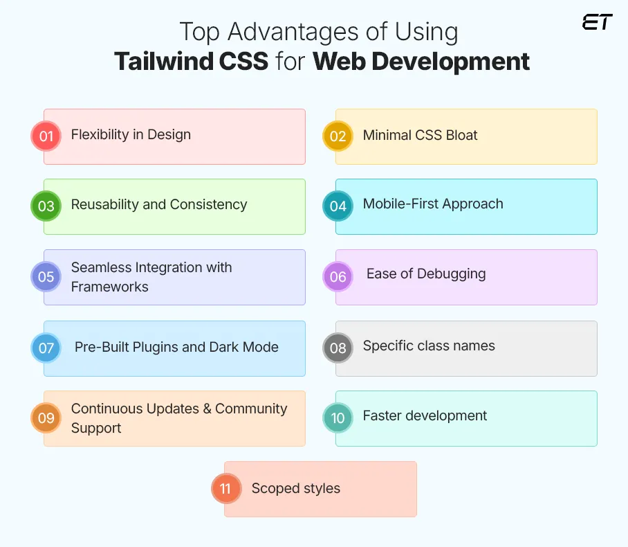
Tailwind streamlines development, enhances performance, and offers unmatched flexibility, making it a go-to framework for modern web design. Here are the key benefits of using this framework.
-
Flexibility in Design
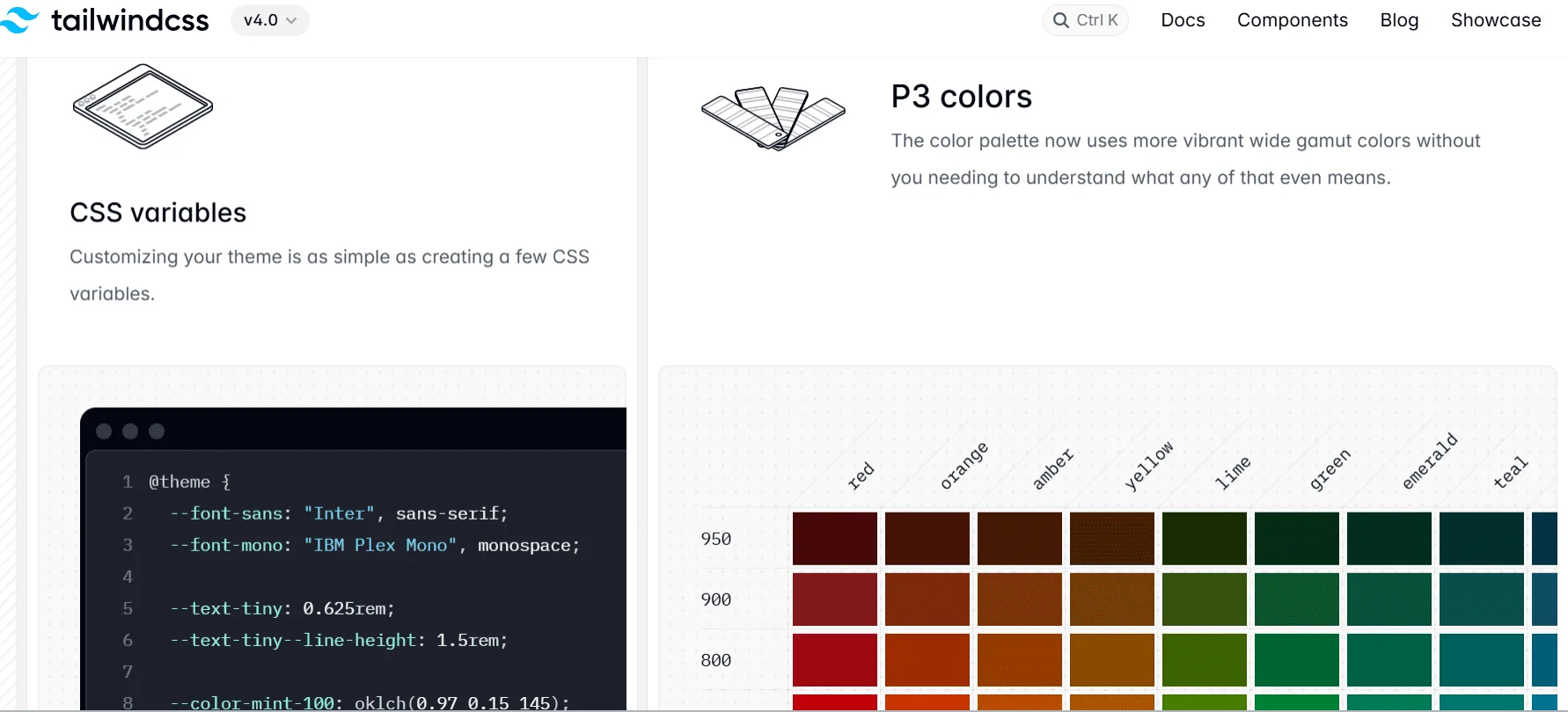
One of Tailwind’s biggest benefits is that it eliminates the need to develop unique CSS for each element. Using the tailwind.config.js file, Tailwind offers complete customization. Developers can alter the default styles and add unique colors, fonts, spacing, and other elements to suit project requirements. For instance, if the background color or padding needs to be altered, all they need to do is add a utility class, such as p-4 or bg-blue-500.
-
Minimal CSS Bloat
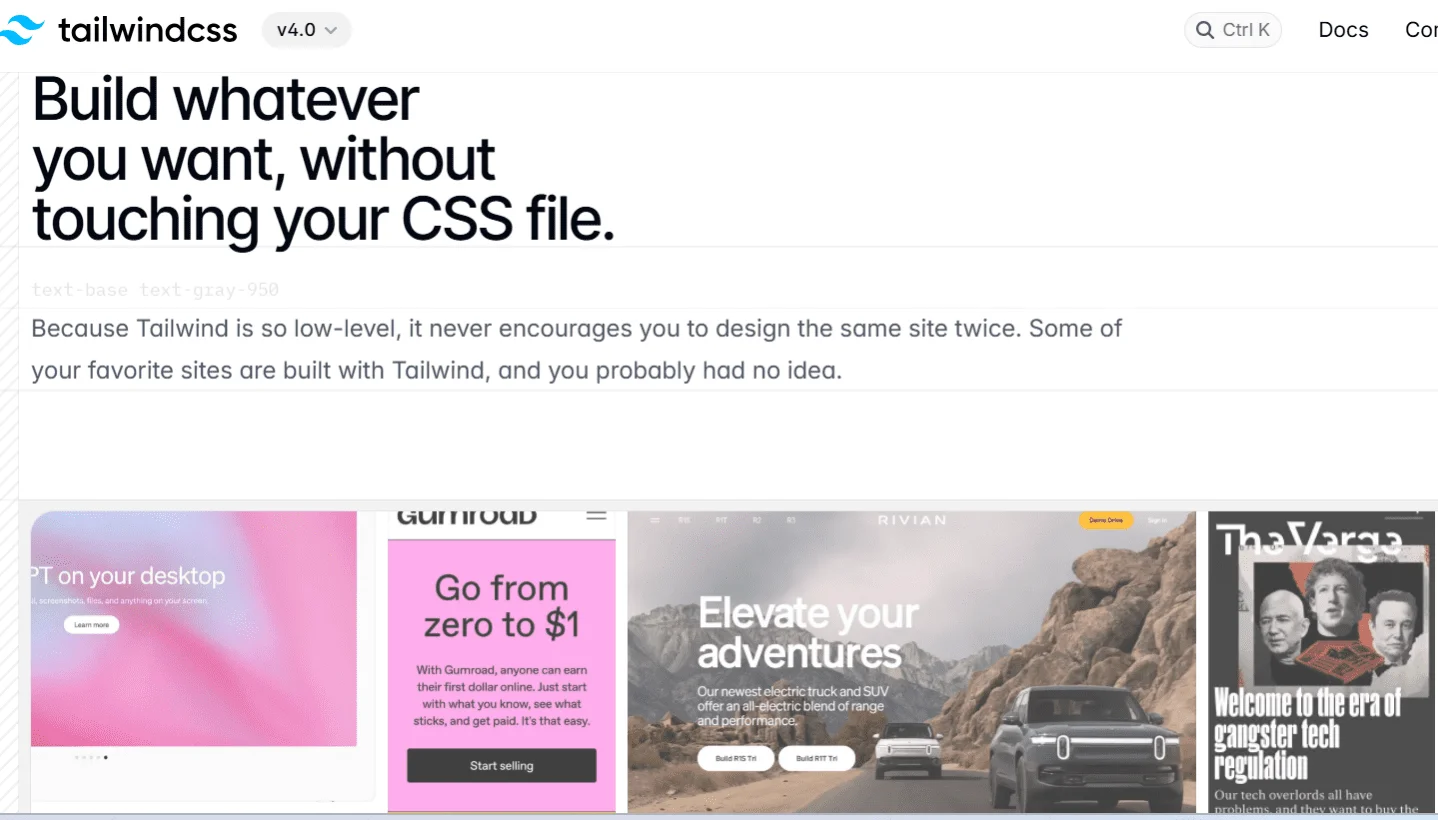
Unlike conventional CSS frameworks, this framework keeps style sheets clean by only producing the CSS required for your project. Integrating with PurgeCSS eliminates unnecessary styles during the build process, avoids bloat, and creates a leaner, more effective, and faster-loading page.
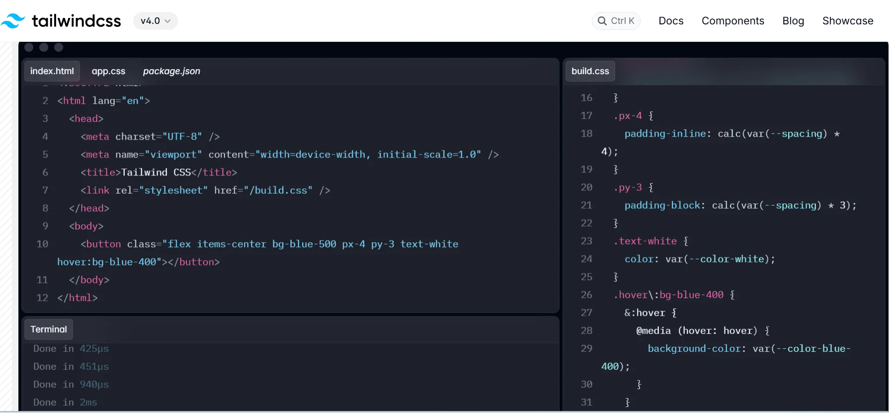
-
Reusability and Consistency
Tailwind will promote the same collection of utility classes throughout your project. By utilizing utility classes to maintain a uniform design language between projects, development teams can minimize discrepancies and enhance cooperation. This will ensure a uniform appearance and feel throughout your online project and expedite development.
-
Mobile-First Approach
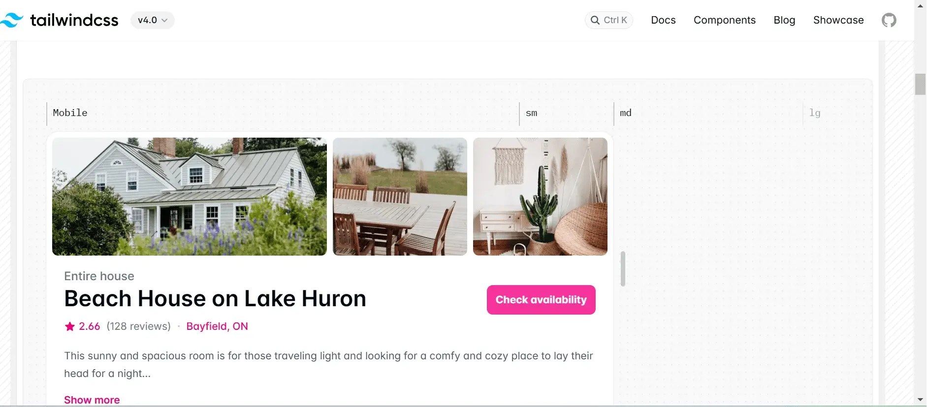
Tailwind makes creating responsive layouts relatively simpler. It’s integrated responsive tools remove the need to write intricate media queries, accelerating design and development. The framework’s built-in responsiveness ensures your website works and looks fantastic across all platforms, which is especially crucial for mobile-focused browsing experiences.
-
Seamless Integration with Frameworks
Tailwind is ideal for modern web applications since it easily interfaces with frameworks like React, Vue, Angular, and Next.js. It ensures seamless interoperability across projects because it isn’t restricted to any JavaScript framework. Its adaptability makes adoption simple and eliminates concerns about compatibility or integration problems.
Front End Development Companies & the Power of JavaScript Frameworks.
-
Ease of Debugging
Each utility class in this framework has a single, clear purpose, making debugging simple. If padding appears incorrect, you can quickly inspect the HTML for classes like p-2 or p-4 instead of searching through CSS files. This streamlined approach enhances efficiency and reduces troubleshooting time.
-
Pre-Built Plugins and Dark Mode

Tailwind offers a range of official and community plugins, including tools for aspect ratio, forms, and typography. It also has built-in support for dark mode, which permits smooth customization and increased design flexibility in modern web development.
-
Specific class names
Naming classes is a typical CSS problem that Tailwind solves with simple, function-specific utility classes. It simplifies styling by reducing the requirement for special classes. With Tailwind’s pre-defined design scheme, you can guess class names without continual documentation reference and avoid complicated names.
-
Continuous Updates & Community Support
With a sizable and vibrant developer community, Tailwind CSS offers a wealth of tutorials, documentation, and support materials. This styling method adapts to the changing digital landscape, making it suitable for a variety of development settings.
-
Faster development
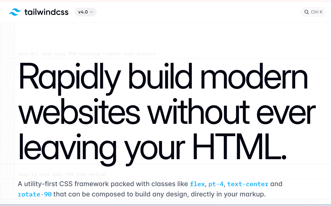
Using Tailwind speeds up large application development by allowing dedicated developers to apply styles directly in HTML with utility classes, eliminating the need to navigate CSS files. This approach accelerates development and reduces the need for extensive custom styling, making the process more efficient.
-
Scoped styles
Modifying styles with traditional CSS can unintentionally affect the entire site. Tailwind’s utility classes prevent this by allowing localized changes to specific elements without altering the global stylesheet. This ensures safer, more controlled styling adjustments, reducing the risk of unintended design issues across the project.
Tailwind CSS Setup: How to Install and Configure

Before installing Tailwind, ensure Node.js is installed to use npm in the terminal. Also, set up your project with the necessary files. Your project structure should look like this:
| -Tailwind-tutorial -public -index.html -styles.css -src -styles.css |
Once ready, you can proceed with Tailwind installation and integration.
STEP 1: Install Tailwind via npm
To install Tailwind CSS using Node Package Manager (npm), open your command line, navigate to your project folder, and run the installation command.
Note: Before using any npm package, initialize npm in your project using:
| npm init |
It generates a package.json file, essential for managing dependencies.
STEP 2: Install Tailwind CSS
| npm install -D tailwindcss postcss autoprefixer npx tailwindcss init -p |
This creates a tailwind.config.js file for customization. This file allows you to define custom styles. If left unchanged, Tailwind’s default styles apply. You can customize various aspects, including colors, screen sizes, and fonts, to tailor the design system to your project’s specific needs.
STEP 3: Configure Tailwind
In the tailwind.config.js file, you must specify the template paths containing Tailwind class names. This allows Tailwind to scan those files and generate the necessary styles. The configuration is done in the content section of the file to ensure proper style generation.
| module.exports = { content: [“./src/**/*.{html,js}”], theme: { extend: {}, }, plugins: [], } |
Thanks to the file paths provided in the content array, Tailwind can eliminate any unnecessary styles during build time.
STEP 4: Add Tailwind to Your CSS
Next, add the @tailwind directives to your CSS file in the src folder, where Tailwind generates its utility styles. Create a main CSS file and include Tailwind directives like @apply, @tailwind, and @layer. These special at-rules enhance functionality, allowing efficient styling within your Tailwind project.
| @tailwind base; @tailwind components; @tailwind utilities; |
STEP 5: Start the build process
Tailwind generates the necessary CSS by scanning HTML and static files for utility classes to compile and refresh styles automatically. The build procedure can be executed in package.json or using the command line. You must manually rebuild to view changes unless you use –watch, which activates automatic updates.
| npx tailwindcss -i ./src/styles.css -o ./public/styles.css –watch |
Step 6: Start Your Development Server
Our styles will be built when we enter the command “npm run build” into our command line.
| npm run dev |
This ensures Tailwind processes your styles correctly.
Get Tailwind up and running quickly! Connect with us for hassle-free installation and expert support.
How to use Tailwind CSS: Expert Tips and Best Practices
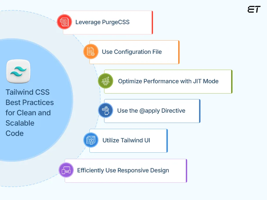
This framework takes a utility-first approach to styling, resulting in faster and more maintainable designs. Follow these expert tips and best practices to get the most out of it.
-
Leverage PurgeCSS
One of the most frequent concerns is Tailwind’s potential for bloat due to its many utility classes. However, you can automatically eliminate unnecessary CSS by configuring PurgeCSS, which will decrease the size of the final file and enhance performance. Set up tailwind.config.js.
| module.exports = { content: [“./src/**/*.{html,js}”], theme: { extend: {} }, plugins: [], }; |
-
Use Configuration File
It’s a good idea to use a configuration file (tailwind.config.js) since it makes style modification, scalability, and maintainability possible. With this file, you can specify custom screens and breakpoints, add new utility classes, and extend the default theme.
Example: Customizing Colors in tailwind.config.js
| module.exports = { theme: { extend: { colors: { primary: “#1E40AF”, }, }, }, }; |
| <div class=”bg-primary text-white p-4″>Custom Color</div> |
-
Optimize Performance with JIT Mode
Just-In-Time (JIT) mode improves performance by generating only the required styles, reducing file size and build time. This ensures faster builds and smaller CSS output by compiling styles dynamically.
| module.exports = {
mode: “jit”, content: [“./src/**/*.{html,js}”], theme: { extend: {} }, }; |
-
Use the @apply Directive
Tailwind encourages utility classes; however, in order to maintain clean code, repetitive styles should be combined using @apply. Doing this keeps your HTML clean while maintaining Tailwind’s flexibility.
| /* styles.css */ .btn { @apply bg-blue-500 text-white font-bold py-2 px-4 rounded; } |
| <button class=”btn”>Click Me</button> |
-
Utilize Tailwind UI
Consider including Tailwind UI, a collection of pre-made components created with Tailwind CSS, to save even more time. Tailwind UI is a set of professionally created elements that improve design quality, consistency, and development speed. It preserves Tailwind’s versatility and guarantees a refined user experience.
Example: Using Tailwind UI Components
| <button class=”bg-blue-500 hover:bg-blue-700 text-white font-bold py-2 px-4 rounded”>
Click Me </button>
|
Use Tailwind UI in UXPin Merge, a drag-and-drop tool for code-backed UI components. If a component is missing, add a custom component or generate one with AI Component Creator. Try it for free from UXPin.
-
Efficiently Use Responsive Design
A mobile-first design approach, which is the industry norm for modern web development, is promoted by Tailwind. Tailwind simplifies responsive design with mobile-first breakpoints (sm, md, lg, xl). Apply styles for different screen sizes using prefixes.
| <div class=”text-lg md:text-xl lg:text-2xl”>Responsive Text</div> |
How Tailwind CSS Stands Out from Traditional CSS & Frameworks
With so many capabilities, Tailwind is a favorite for modern web development. In contrast to well-known frameworks like Bootstrap and Foundation or traditional CSS, Tailwind adopts a different strategy by offering low-level utility classes in place of pre-made components. We are highlighting several key points demonstrating why Tailwind CSS is superior to traditional CSS and other frameworks.
-
Design Approach
The utility-first methodology of Tailwind provides designers with complete control over the look and feel of their projects, ensuring greater creativity and adaptability compared to traditional frameworks like Bootstrap.
Bootstrap relies on pre-designed components like buttons and navbars, making it useful for quickly building standardized layouts. However, Tailwind takes a more flexible approach by using utility classes, allowing developers to craft fully customized and unique designs without being restricted by predefined styles.
-
Learning curve
To use Tailwind, a thorough understanding of CSS is needed. On the other hand, most other frameworks only require you to know which component will be fleshed out when you use a class name. For example, if you are unfamiliar with CSS frameworks, Bootstrap’s component-based methodology may seem simpler. However, creating custom designs will be simpler after you get familiar with Tailwind’s utility classes.
-
Customization Without Hassle
The preset themes and components included in Bootstrap and other frameworks must be overridden to be customized. Tailwind, on the other hand, gives you total control over styling with its tailwind.config.js file. This means you can easily change colors, spacing, font, and more without having to write a lot of CSS. Although Tailwind CSS’s configuration file allows for a great deal of customization, it maintains consistency by limiting developers to a predetermined number of utility classes (unless they manually add additional ones).
Enhance Business Automation Solutions with Custom Web App Development
-
Extensive documentation
Tailwind CSS offers highly detailed, well-structured documentation with interactive code previews, ready-to-use snippets, and extensive customization guidance. Unlike other frameworks, it emphasizes a utility-first approach, making it easier to learn and implement. Frequent updates and community contributions ensure that developers always have access to the latest best practices.
-
Size and Performance
Tailwind CSS is highly optimized for size and performance, unlike traditional frameworks that include unused styles. Tailwind uses PurgeCSS to remove unused styles, resulting in smaller file sizes. Other frameworks like Bootstrap, in contrast, come with many default styles, which can increase the overall size of your CSS.
In summary, Tailwind CSS stands out by offering a highly customizable, utility-first, and performance-optimized approach, making web development faster and more efficient than traditional CSS and other frameworks.
Frontend Development Frameworks: Which One Is Right for You?
Leading web development companies trust Tailwind CSS—build your top-notch web application with our experts now!
Do You Prefer CSS Modules or Tailwind? Pros & Cons Compared
Many developers prefer traditional CSS for its control, readability, and separation of concerns, using methodologies like BEM or CSS Modules. Tailwind’s utility-first approach can feel overwhelming, and some teams resist changing workflows. Choosing between CSS and Tailwind depends on your experience, needs, and project requirements. Both are great for styling—consider their pros and cons before making a final decision.
Pros & Cons of Traditional CSS
| Pros | Cons |
| It allows full customization without relying on predefined classes. | It requires maintaining separate stylesheets, which can grow complex. |
| It consists of organized code using methodologies like BEM or CSS modules. | Writing custom styles takes more time compared to utility-based frameworks. |
| Keeps HTML clean by defining styles in external CSS files. |
Stylesheets may contain unused or redundant styles, increasing file size. |
| Widely supported & flexible, as it works with any project without framework dependency. | Without strict methodologies, styles can become unmanageable in large projects. |
Pros & Cons of Tailwind CSS
| Pros | Cons |
| Its utility classes reduce the need to write custom CSS, speeding up the workflow. | Extensive utility classes can make HTML cluttered and harder to read. |
| Built-in PurgeCSS removes unused styles, optimizing performance. | Unlike Bootstrap, it doesn’t provide ready-made UI elements. |
| It is easily configurable via tailwind.config.js for personalized design systems. |
It requires understanding numerous utility classes, which can be overwhelming for beginners. |
| It ensures consistent styling across large applications without conflicts. | Excessive class names can reduce readability compared to traditional CSS. |
Tailwind CSS: Utility-first Styling for Fast, Maintainable Development
Today’s web development requires accuracy, speed, and flexibility. One tool that aids developers in achieving these objectives is Tailwind CSS. This approach delivers speed, versatility, and control, whether you’re looking to enhance your development workflow or offer custom web development services.
Tailwind enables you to quickly and easily create responsive and aesthetically pleasing interfaces by redirecting the emphasis from traditional CSS elements to useful utility classes. It is quick, light, and modular, but it also has drawbacks, like being challenging for people who are unfamiliar with the framework or don’t have a clear design vision; producing verbose, cluttered HTML code unless you use a preprocessor like Sass or PostCSS; and requiring more experimentation and learning for complex or advanced effects.
All in all, we can say that Tailwind is straightforward and simple to comprehend. Although it may take some time for you to become familiar with all of the utility class names, but don’t worry—you may refer to their documentation and reach out to professional developers whenever you get stuck.
By hiring a reliable software development company, businesses save time, achieve high-quality UI/UX, and build maintainable, production-ready web applications. Web development companies streamline Tailwind CSS implementation by leveraging their expertise to create efficient, scalable, and responsive designs. They ensure best practices like JIT mode, PurgeCSS, and custom configurations for optimized performance.
We hope this write-up proves helpful! If you still have questions, feel free to connect, and we can clear up any doubts together.
Frequently Asked Questions
What is the purpose of Tailwind CSS?
Tailwind is a utility-first framework used for rapidly building modern, responsive designs. It provides low-level utility classes, enabling developers to style applications efficiently without writing custom CSS, making development faster and more scalable.
Is Tailwind CSS available for free?
Yes, Tailwind CSS is free and open-source. However, Tailwind also provides premium products like Tailwind UI for pre-built components and Tailwind Enterprise for advanced team features.

Is Tailwind easy to learn?
Tailwind CSS is relatively easier to learn, especially for those familiar with HTML and CSS. Its utility-first approach may feel different initially, but with practice, dedicated developers can quickly grasp its class-based styling and improve workflow efficiency.
Tailwind vs Botstrap: which is best?
Tailwind and Bootstrap serve different needs. Tailwind offers full design flexibility with utility classes, while Bootstrap provides pre-styled components for faster development. Tailwind is best for customization, whereas Bootstrap is ideal for quick, consistent layouts. The choice depends on project requirements.
Frontend Development Frameworks: Which One Is Right for You?
Is Tailwind suitable for big projects?
Yes, Tailwind CSS is suitable for big projects. With features like PurgeCSS for optimization and a customizable design system, Tailwind helps manage large codebases efficiently while keeping styles lightweight and organized.
Build a high-performance, result-oriented web application with our expert developers.


